Charles River Laboratories
Revamping wayfinding for the corporate site of a $12 billion company
By consolidating multiple fragmented navigations into a unified mega menu, 70% of overall navigation clicks now originate from the third and fourth levels. This indicates that users are accessing content more efficiently, resulting in cost savings for the company.
Role
UX Lead
End Users
Charles River Customers
Project Duration
1 Year +
Responsibilities
Research + Discovery
Usability Testing
Interaction + Design
Background
With an $8.82 billion valuation and rapid acquisition-driven growth, Charles River had become a complex organization with multiple overlapping products and services. Their website (Criver.com) was seven years old and reflected that complexity: it used internal jargon, segmented user journeys, outdated interaction and visual design, and suffered from fragmented navigation that forced users into multiple disparate flows.
During discovery, global navigation emerged as a major pain point: users couldn’t efficiently access deeper content, ended up relying on page-level navigation, and found the IA confusing.
Approach

Discovery & Research:
Conducted “Voice of Customer” interviews with 33 internal employees across 8 business units.
Created a Customer Advisory Board (CAB) of 14 customers representing roles from scientist to CEO to academic; used generative exercises (card sorting, tree testing) to understand terminology and IA.
Ran analytics and heat-map reviews to identify top visited pages and page-level navigation issues.

Defining the Pain Points:
Design debt: current navigation could not expose deep content.
Information architecture: fragmented structure across business units.
Language mismatch: internal terminology did not align with how customers search or think.
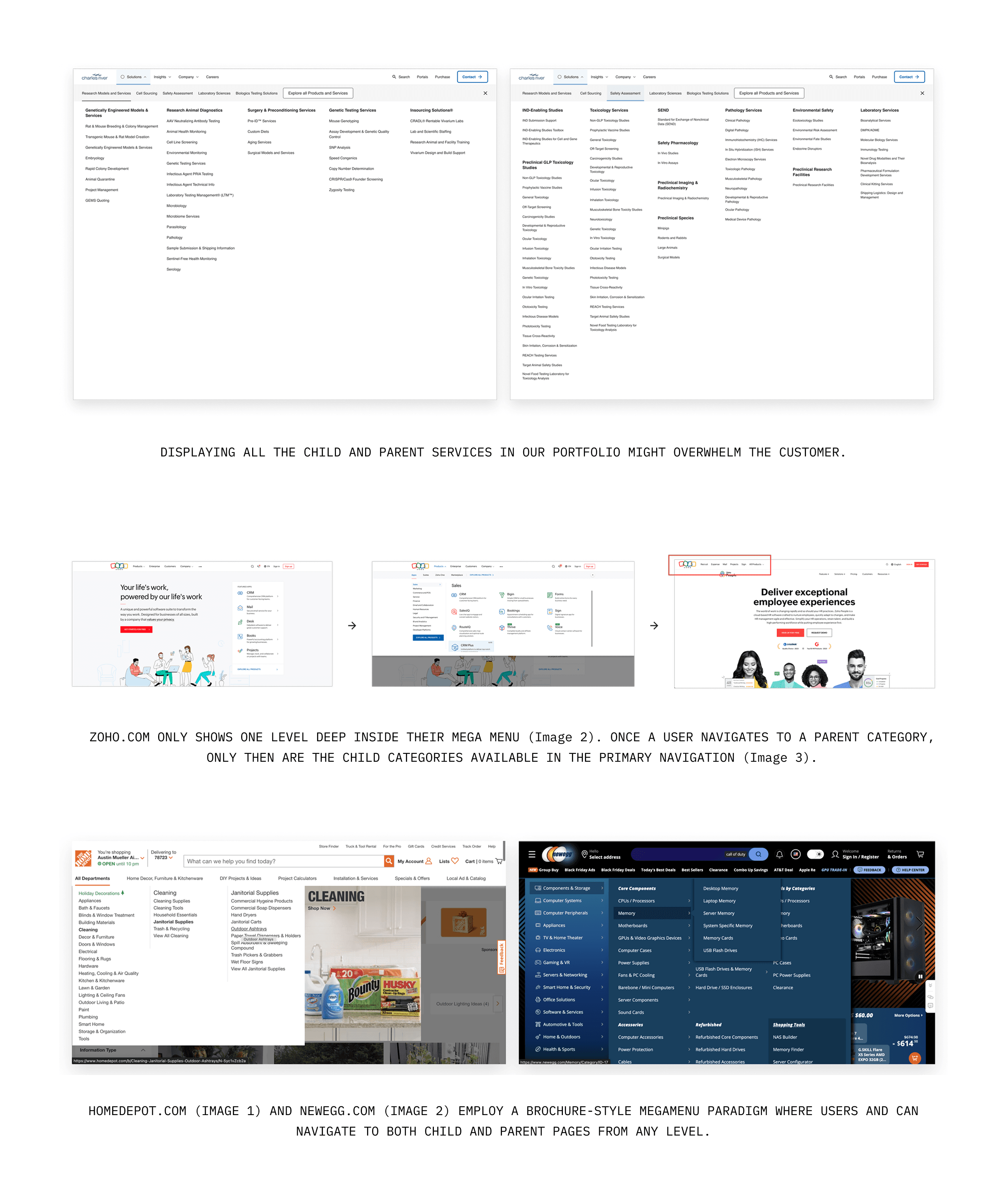
Ideation and Solution:
Explored three concepts: Exposed Categories Mega Menu, Parent Landing Pages, and Brochure-Style Mega Menu.
Selected the Brochure-Style Mega Menu for its ability to surface deeper pages and reduce friction.
Prototyped and tested with users, addressing issues like clutter, close-button behavior, and prioritizing key links.
Implementation:
Launched the new navigation as an MVP to rapidly improve usability while larger IA and taxonomy efforts continued.
Monitored post-launch analytics to measure improvements and identify refinement opportunities.
Impact
The Google Lighthouse accessibility score improved from 76 to 95
Analytics indicate higher visitor engagement (sessions lasting 10+ seconds, with key events, or 2+ page views)
The website is now the top driver of net new leads and opportunities, accounting for 62.5% of conversions